Cook's Guide — Guiding beginners from burnt toast to brag-worthy meals.
Role: UX/UI Designer
Industry: Food
Tools: Figma
Duration: 5 months

OVERVIEW
Cooking Smarter, Not Harder
Beginner cooks often struggle to find clear, easy-to-follow recipes that match their skill level and available ingredients. This can lead to frustration and a lack of confidence in the kitchen.
The goal for this app was to create a design that specifically supports beginner cooks, offering step-by-step instructions, clear guidance, and opportunities to improve cooking skills. The aim was to help new cooks gain confidence in the kitchen without feeling overwhelmed.
As the lead UX developer, I conducted user research, designed the overall layout of the app, created paper prototypes and low- and high-fidelity prototypes, and conducted user testing to ensure the app effectively met all user needs.
BACKGROUND
Cooking In a Fast-Paced World
In today’s fast-paced world, many people want to cook at home but lack the skills or confidence to begin. Beginner cooks often struggle with complex instructions, unclear measurements, and missing foundational knowledge. With a growing interest in healthier eating and budget-friendly meals, there is
a strong demand for accessible cooking guidance.
The recipe app industry is shifting towards personalization, visual learning, and step-by-step instructions. Short videos, interactive tools, and beginner-friendly content are increasingly popular. These trends emphasize the need for intuitive, supportive cooking experiences. Top apps like Tasty
and Yummly offer polished content but often overwhelm beginners with advanced recipes or too
many options.
There's a gap in the market for an app that focuses solely on absolute beginners offering simple recipes, clear instructions, and confidence-building tips in a welcoming, user-friendly interface.
RESEARCH
User Research
The user research process for the app began targeting people with varying cooking experience. From this, I created six distinct personas: Beginner Bella, Fast-Track Frank, Gourmet Gabriella, Nutrition Nate, Party Pete, and Seasoned Sally. Each represented a different motivation and skill level. However, Beginner Bella was prioritized as the core focus, embodying users who are new to cooking, often anxious, and in need of clear, supportive guidance.
I mapped user journeys for beginner Bella, highlighting key moments like recipe discovery, decision-making, cooking steps, and post-cooking reflections. These journeys helped identify pain points such as information overload, unclear instructions, and lack of confidence.
From this, the problem statement was defined: All users need a cooking app that provides personalized, clear, and confidence-boosting guidance tailored to their experience level, preferences, and goals. This insight shaped the app's focus on simplicity, support, and personalization.


DESIGN
Design Ideation
I started the solution design by identifying the key tasks users needed to accomplish, such as finding recipes, easily following preparation steps, and learning essential cooking skills.
My early ideation sketches focused on creating simple navigation flows and core screens, including the home dashboard, recipe viewer, and step-by-step mode.
Next, I developed Use Case Diagrams to illustrate how my prioritized persona (beginner Bella) interacts with the app, and paying particular attention to the needs.
To prioritize features for the recipe app, I explored various options, from voice-guided cooking steps to a pantry tracker. Using a MoSCoW analysis, I organized the features into priority categories as follows:
This analysis helped ensure a user-centered, manageable feature set tailored to beginner cooks.
I then mapped key inputs such as selecting a recipe to cook, applying filters or categories (e.g., time, difficulty), viewing pictures and descriptions of basic meals, creating a grocery list, and saving recipes for future use to specific outputs that enhance usability. Mapping Inputs & Outputs helped me prioritize essential features that simplify the cooking process, build user confidence, and make learning to cook accessible and enjoyable.


NAME EXPLORATION
App Name Development
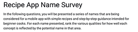
To create a name that resonates with beginner cooks, I explored several options that reflect simplicity, guidance, and friendliness. My brainstorming for the app name focused on conveying ease, support, and everyday usability. I shortlisted nine potential names: Easy Eats, Cooks Guide, Kitchen Companion, Yum Mate, Fresh and Easy, Everyday Eats, First Time Feasts, Rookies Plate, and Kitchen Kickoff.
Next, using google forms I surveyed users who represent our key persona, Beginner Bella, and asked them to rank the names based on how well each conveyed the following personality traits: interactivity, support, friendliness, motivation, and education.
The results showed that Cooks Guide emerged as the clear favorite due to its straightforward and reassuring tone. It effectively communicated the app’s purpose as a helpful, beginner-friendly tool that guides users through cooking. This clarity helped me select a name that aligns with user expectations and the core mission of the app.


INITIAL DEVELOPMENT
Low-Fidelity Prototypes
To begin shaping the user experience for the recipe app, I created low-fidelity wireframes to quickly test layout ideas and core functionality.
Next I sketched paper prototypes for key screens, including the splash screen, home screen, recipe search, recipe view, filters, and step-by-step instructions. These hand-drawn drafts allowed for quick adjustments and feedback during informal testing sessions.
Using Figma, I developed low-fidelity prototypes that emphasized simplicity, large visuals, and clear navigation, which catered to beginner users. I then shared the early prototypes with peers and target users, incorporating their feedback into several iterations. For example, based on their suggestions, we simplified the recipe navigation and added a clearer call-to-action for starting a cooking session.


TESTING
User Testing Of Paper Prototypes
To validate the usability of the recipe app in its early stages; I conducted user testing using paper prototypes. I began by developing tasks that reflected realistic scenarios, such as finding a beginner-friendly brownie recipe and selecting it, locating a saved pasta recipe, searching for a recipe that takes 60 minutes or less, and adding or removing ingredients. These tasks were designed based on the goals of our primary persona, Beginner Bella.
For the test planning, I recruited participants with little to no cooking experience and employed screening questions like, “How often do you cook, and how would you rate your cooking skills?” and “Have you used recipe apps before? If yes, which ones?” This ensured that the participants were relevant to our target audience.
I then created a testing script to guide participants through each task while encouraging them to think aloud. I observed their interactions with the paper interfaces, noting instances of confusion, hesitation, and feedback.
During the testing, users appreciated the clear structure of the app but struggled with icons that lacked visual representation. Additionally, they did not easily notice the “share recipe” option. The findings highlighted the need for more obvious buttons, simpler filters, and clearer visual representations. This round of testing was crucial in helping me shape the recipe app to provide a more intuitive, beginner-friendly interface.


FINAL DESIGNS
High-fidelity Designs
After refining the app structure through low-fidelity testing, I moved on to high-fidelity design using Figma, focusing on visual consistency, accessibility, and clarity. I developed realistic mockups for core features like the homepage, recipe detail view, and icon representation. Testing topics were created to evaluate usability, visual hierarchy, navigation flow, and content clarity. To support this, I designed polished screens that mimicked a functioning app experience, including interactive prototypes.
I then conducted user surveys through Google Forms, sharing the high-fidelity prototype with participants who fit the primary persona. They were asked to answer questions like selecting which icon represents the product better, and which design do you find more appealing, friendlier, and easier on the eyes.
Following the user surveys conducted through Google Forms, I gathered valuable feedback from users aligned with our primary persona. The findings revealed that users were very confident about what most icons meant, and it is important for users to have access to quick and easy recipes.


CONCLUSION
Next Steps
The next steps involve preparing the app for development and further validating it with users. First,
I will refine the prototype based on user feedback, adjusting visual elements such as font size, icon clarity, and layout spacing to enhance usability. I plan to explore opportunities to collaborate with a development team to begin building the minimum viable product (MVP), starting with the essential features identified through a MoSCoW analysis, including recipe browsing, filtering, and
step-by-step instructions.
Additionally, I aim to prepare more detailed user flows, interaction specifications, and design assets to ensure a smooth handoff to the development team. I will also get ready for another round of usability testing using an interactive prototype, either in Figma or a development environment, to identify any remaining pain points.
